I’ll confess, I’m a magazine ho (err, aficionado). But curiosity eventually got the better of me and I just had to see how a magazine could possibly be rendered on an iPhone. So when one of my titles came up for renewal, and they threw in a free digital trial, I decided to take a peek. I won’t comment on the mini-mag reading experience (though, believe you me, there’s plenty of fodder there) but I will say that I’ve been receiving lots of “offers” since I signed up.
The latest one was this. For once–mostly out of professional curiosity–I actually opened this Zinio message.
Once more, I was reminded that there’s a fine line between common sense and user experience design. Case in point, the obvious: there’s no pricing.
Now, I’m no email marketing specialist and I’m sure they have their reasons for not including them, like some sort of BS about measuring clickthrough rates or something. But really, you should already consider it a miracle that anyone would open such an uninspiring subject line as “Save up to 68% on top business news.” We consumers have already been training to understand that “save up to” is a trick to get us into the store, and there’s only one undesirable piece of crap that’s actually on sale.
Assuming I stuck with their campaign, here are the remaining issues:
1. You are given “prices” in percentage of savings. As if anyone a) knows the list price for magazines and b) would mentally do the math to calculate the discounted price. Why wouldn’t they just copy what is a tried-and-true ecommerce formula of crossing out the original price with the sales price and showing the percentage discount to users?
2. If you do actually click through (shock, shock, horror, horror), you then discover that the percentages don’t actually match up. I’m guessing that some crazy A/B test decided to change the pricing on Harvard Business Review on me within 5 seconds, from $99/year (39% savings) to $79/year (53% savings). But best of all, the email had originally promised 64% savings on this title and neither of them matched that!
3. Kiplinger’s apparently is only available to purchase by single issues (or at least that’s what the link takes you to) for a whopping 0% savings.
4. Surprisingly, “up to 68% savings” wasn’t even accurate. I discovered that Bloomberg, which was supposed to be 53% off, turned out to be 82% off the list price. Hmm – that might have made for a more compelling subject line.
5. Zinio fails to acknowledge that their users probably expect the digital version of magazines to cost less than the print version. I know for a fact that most digital subscriptions cost more than the print version — why this is, I can’t imagine.
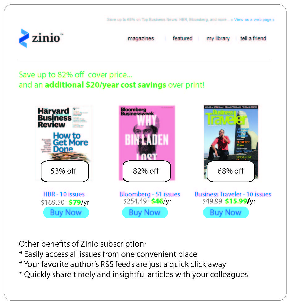
Anyway, I did a 30 minutes redesign of their email – the focus was not on beautifying it but rather:
- I took the liberty of eliminating the somewhat disturbing image of “Headline News” that was doing absolutely nothing except taking up important space and kind of scaring me
- Removing the bizarre “offer” of the 0% discount Kiplinger’s
- Putting the most enticing offer (Bloomberg) first
- Adding typical ecommerce elements, such as pricing and Buy Now buttons
- Highlighting the benefits of a digital subscription. These are ficititious, but for all I know they may all be true. I wouldn’t know because Zinio has never told me the benefits of going digital and I haven’t come across them myself!
- In my somewhat ugly rendition, I also called out the savings on the cover itself. In an ideal world, I would imagine that this would be the cost savings compared to the print edition.
The final quick and dirty layout…
p.s. This is a particularly poor rendering with some absolutely hideous coloring, as my love/hate relationship with Illustrator flared up again in midst of creating this. Illustrator gave me an arcane error message and then refused to export any of my files – future blog post, I suppose! So for now, I have to be satisfied with taking screenshots of my Illustrator files.


